Logo is a four letter word: Branding Cultivate Labs
My name is Jessica Price, and I'm the Creative Director here at Cultivate Labs. I have a background in advertising, branding, and collateral design. And since I'm the only Creative at the company, the work I do changes from day to day. Whether it's website design, creating the style and experience of our products, or – most recently – front end web development, I'm always trying to design a way to solve problems. I recently tackled a pretty tough one — Creating the logo and brand identity for the company.
No matter what I create, it always starts with a sketch. Honestly, I sketched an outline for this blog post before I started typing it. Sketches are impermanent and I'm able to think freely when holding a pencil to paper. It's an important part of my process and gets the low hanging fruit out of the way. So instead of falling in love with my first idea, I find the right one.

When I was tasked with designing the identity of Cultivate Labs, I obsessively started doodling in notebooks and on paper. This was a huge ask. A logo is a single mark that represents the company. It's equivalent to telling a story in a single word.
My first few sketches got all the expected ideas out of the way – plants and leaves (cultivate), beakers and science equipment (labs). These ideas didn't tell the story I wanted our brand to communicate. So I started working on some abstract shapes to create a mark that was purely ours. Some used the shape of the letter 'C'. Some were made up of other smaller concepts. Some were just a way to get ideas flowing. But once I got a few good ones out on paper, I started creating simple black and white vector versions to get a sense of what was working and what wasn't.
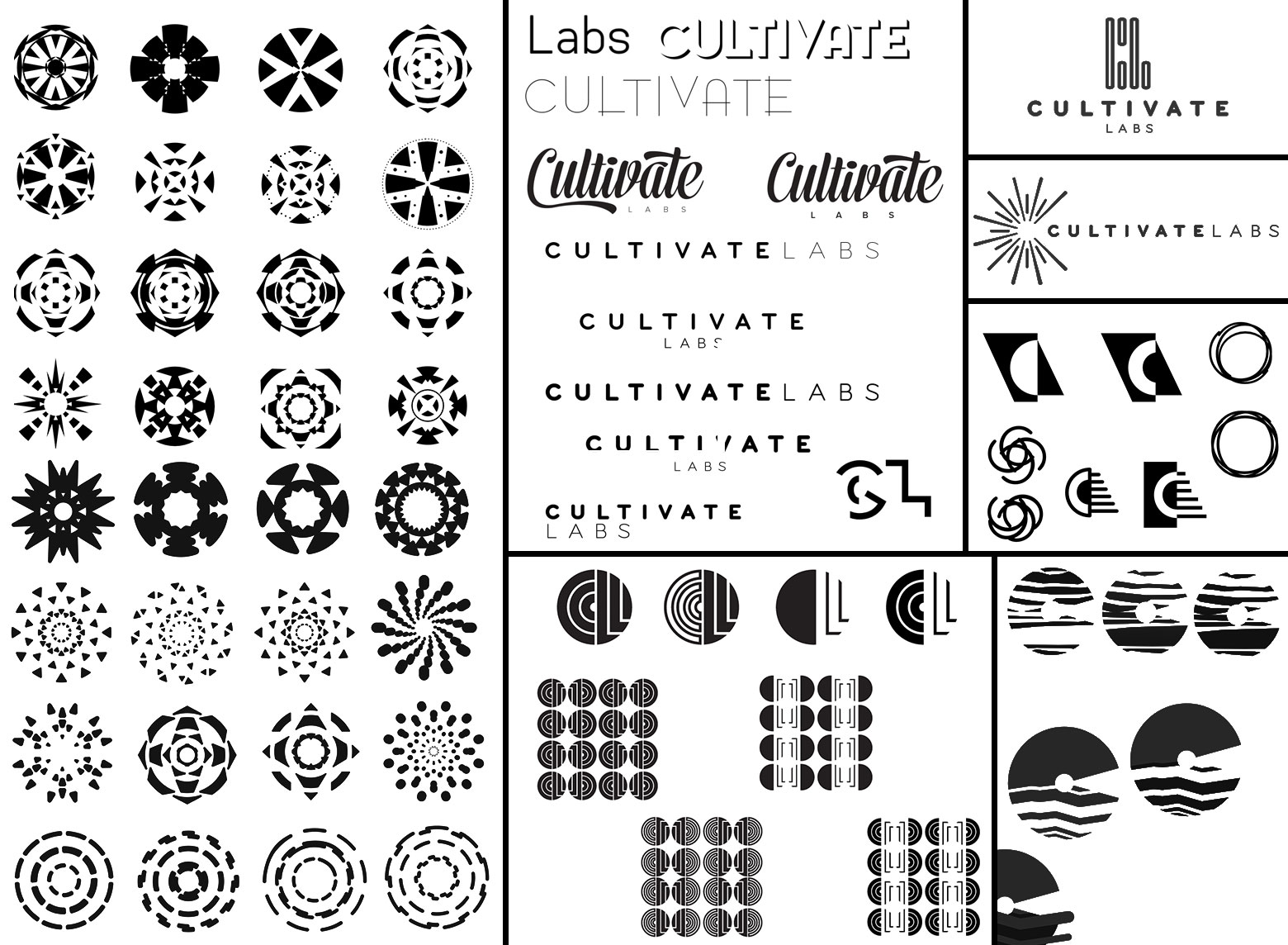
After showing a few concepts to colleagues, we all seemed to agree on a concept I kept coming back to – pieces that make up a whole, working together and movement.
Cultivate Labs uses crowdsourcing techniques like prediction markets and crowdfunding inside organizations to give decision makers ongoing, real-time, predictions from their own people to help inform their most important strategic and investment decisions. I wanted our logo to be made up of elements that created movement, energy and unity. And after a few iterations, we landed on the mark that's live on the site today. It's made up of small triangular elements moving together to make a radial shape. The color palette is lively, but not in your face. With the abstract shape we were able to create separate logos for each of our software products using simpler versions of the main logo. We were also able to create a textural element by layering the product logos.

When you're creating an identity for a company, especially when it's your own, sometimes it's hard to know when to stop pushing pixels and call it a day. It felt great that everyone was so excited about the final design, and I took it as a good sign that they enthusiastically talked about different ways to share our new brand with clients and the public. Seeing the brand come to life on collateral, our website and products made me feel confident we made the right decision.
The identity for Cultivate Labs is meant to be friendly and motivating. We want our logo to symbolize a new way to efficiently do business by changing how people and organizations work together.
I could go on and on about the thought process behind the logo, our brand colors, fonts and elements, and the little ideas that brought me to the final designs. But I won't go total design nerd for this post. If you do want to geek out on design you can reach me through our twitter @cultivatelabs and we can talk about how important negative space is and why I chose a sans serif font for our logo.