Evaluating User Forecasts By Percentile
In my last post looking at my own forecasting history, I showed that a majority of my forecasts decreased market accuracy, but that small decreases were more than offset by a smaller number of large accuracy improvements. In this post I'll examine why this approach has been effective by splitting out my forecasts based on the specific probabilities I forecast.
One tricky issue in analyzing forecaster performance in a prediction market is that individual forecasts don't necessarily represent users' beliefs about a specific likelihood of an event. When someone changes a forecasts from 14.9% to 15%, it doesn't mean they think the event is going to happen, and it also doesn't mean they think the probability is exactly 15%; it means they think the probability is at least 15%. If the forecaster is correct, they're moving the market in the right direction, which improves the market's accuracy.
To analyze forecasts' accuracy, I looked specifically at forecasts that crossed percentile thresholds, and then examined how often the result being forecast actually occurred. For example, if my forecast adjust a market from 73.5% to 72.2%, then that forecast crossed one percentile threshold: 73%. (Note that many forecasts crossed multiple percentile thresholds while some didn't cross any.)
The following chart shows how often events occurred after I bought (forecasted upwards) across different percentiles:
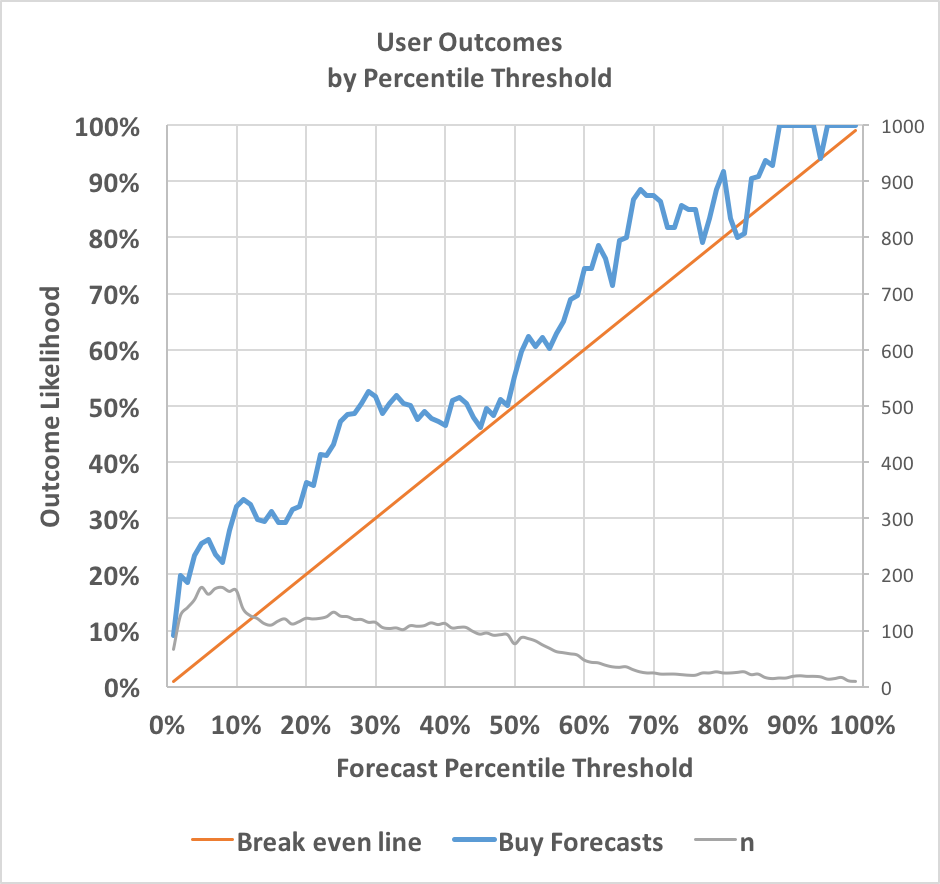
The blue line represents how often events occurred after I bought across a given percentile threshold. For instance, when I forecast from below 5% to above 5%, the event occurred 26% of the time. When I forecast from below 65% to above 65%, the event occurred 79% of the time. The red line shows how often events would need to occur for me to break even. Since the results are almost always higher, my forecasting is profitable at almost every probability.
The grey line depicts sample size and uses the right-hand axis; it shows that I was more likely to forecast upwards when the existing probability was low. Note that because many forecasts crossed multiple thresholds, the total sample size exceeds my total number of forecasts.
The next chart is the same, but for forecasts where I decreased the market probability:
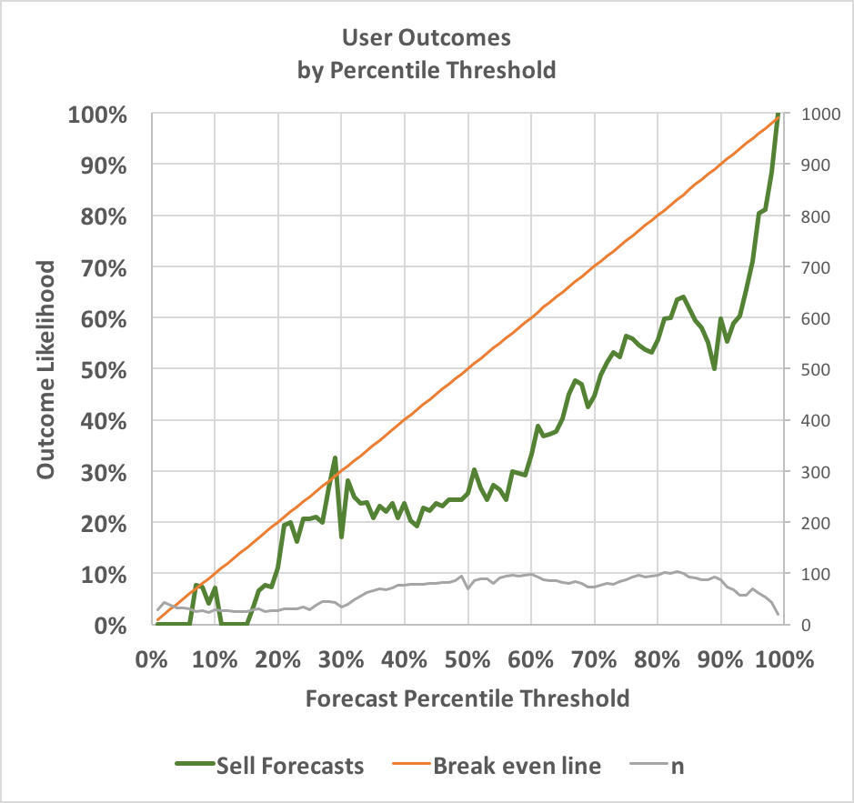
Here the green line shows how often events occurred after I sold. This time, the line is nearly consistently below the red break even line, again indicating my forecasts are profitable across almost any threshold. When I forecast from above 95% to below 95%, the event occurred only 71% of the time. When I forecast from above 40% to below 40%, the event occurred only 24% of the time.
With three exceptions (buying at 82%-83% and selling at 29%), my forecasting is improving accuracy across all percentile thresholds in both directions--not bad! It's also worth noting that my forecasts are particularly successful when I focus on long-shots, and that I do so most of the time. The blue line is farthest above the red when forecasting at low probabilities, and the green line is farthest below the red when forecasting at high probabilities.
In my next post, I'll look at exactly how much I improved market accuracy at varying probability thresholds.
If you liked this post, follow us on Twitter at @cultivatelabs, and sign up for our
monthly
newsletter.
Ben Golden/@BenGoldn
is an Engineer and Data Scientist
at Cultivate
Labs.